Responsive Vertical Navigation bar


Try The Live Navigation Bar Demo
Try the navigation bar and see it in action by clicking the menu button in the top left of this page.
On mobile, tablets and desktop you can customize how you want the menu to be displayed. The navigation menu can always be showing on larger screens while hidden on smaller screens.
In all cases, the menu is completely responsive and can be fully customized to match the style of your website.

Responsive Vertical Navigation Menu
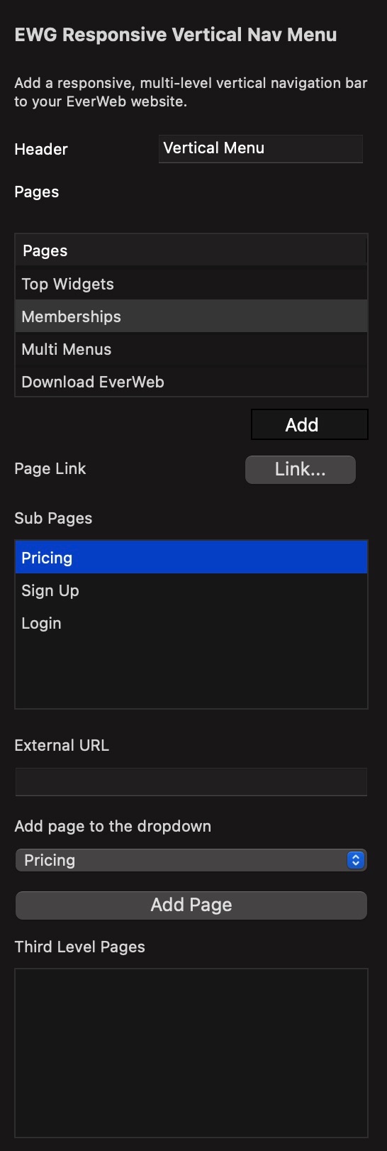
With the Responsive, vertical navigation bar for EverWeb you can easily add a side bar to your EverWeb website.
From the inspector you can add up to 2 sub menu levels, so that means 3 menus in total.
You can select a link to any page on your website or enter an external URL to navigate to.
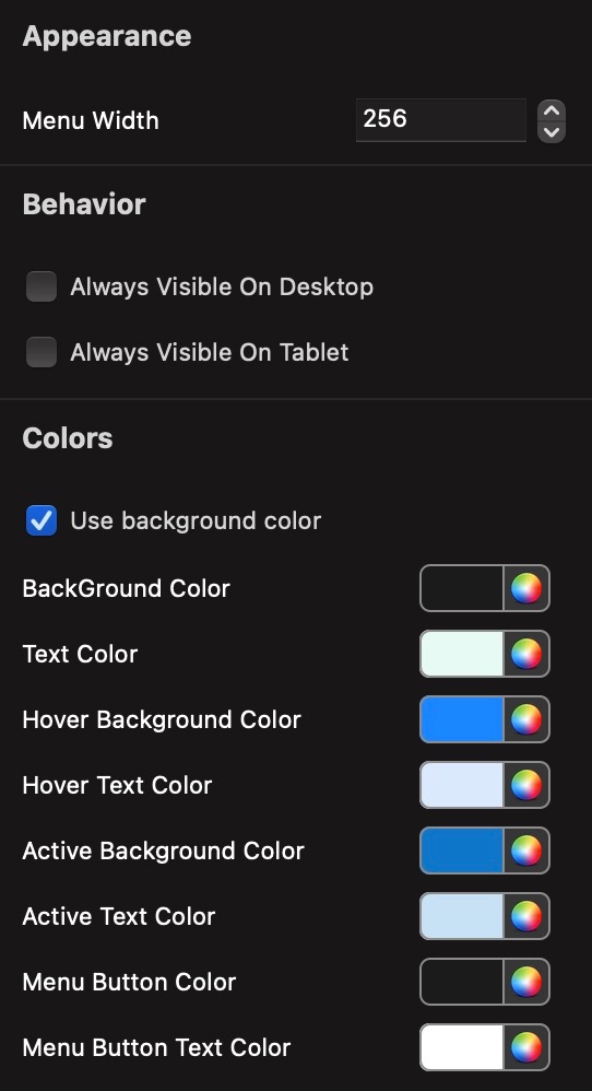
Appearance & Styling
You can customize the navigation bar to match the styles and colors of your website.
You can also specify the menu width and whether you'd like the menu to always be visible on Desktop and Tablet screens.
The styling of your menus is completely customizable to look great on any website.